Have you ever seen anything that was so unusual that you could not help but rub at your eyes and take a closer look? It seems impossible that you are truly seeing this with your own two eyes. You probably wonder, “How did this even happen?”
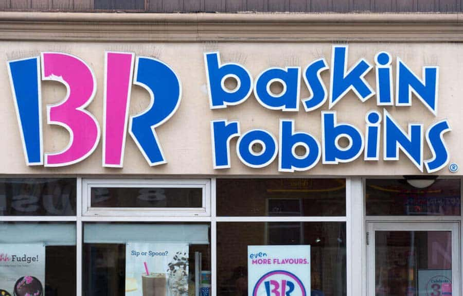
The Baskin Robbins Logo
We all love the ice cream from Baskin Robbins, but did you know that its logo is even more creative than you thought? The fun font and colors account for part of it. It evokes a certain childish wonder in anyone who sees it! However, there is a secret message hiding in there.

The Baskin Robbins Logo
The color-blocking technique makes it even more childish, although it is also used to hide the “31” in the logo! The number stands for the original flavors that the company offered upon opening in 1948. To this day, they still want to emphasize those 31 flavors. Another fun fact is that Baskin Robbins was the first store to offer samples. Where would we be if they had not introduced that?
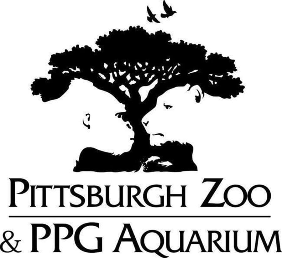
The Pittsburgh Zoo Logo
At first glance, you might think that the Pittsburgh Zoo is fairly simple. What is so special about a tree surrounded by flying birds? While we have to admit that it is pretty outdoorsy and perfect for a zoo, it is nothing particularly spectacular. That is until you spot the lion and gorilla faces embedded in the logo.

The Pittsburgh Zoo Logo
If you saw the two animal faces right away, good job. But did you also spot the fish jumping out of ‘water’ at the base of the tree? This is the logo that keeps on giving. Check out how one of the most recognized brands in the world evolved their clever logo over time.
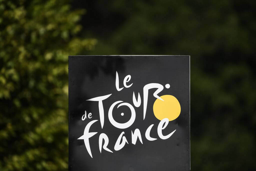
The Tour de France Logo
We all know that the Le Tour de France logo is pretty funky. If you are not familiar with it, this is a cycling race that happens in France for three weeks. The logo is abstract, modern, and attractive. However, many people fail to see the image hidden in the stylized “tour” on it.

The Tour de France Logo
The yellow circle in the logo stands for two things. On a more obvious note, it stands for the trademark yellow jerseys the winners win. However, it also has a less obvious meaning. Look closer and you might see that, together with the “O” in “tour”, it shows a man riding a bicycle! This ingenious logo was debuted in 2003 for the centennial anniversary of the race. Isn’t it powerful?
